logotype
  • HOME
    • Homepage 1
    • Homepage 3
    • Homepage 4
    • Homepage 2
    • Homepage 6
    • Homepage 5

    [   main home   ]

    [   studio minimal   ]

    [   digital agency   ]

    [   creative company   ]

    [   web agency   ]

    [   ui/ux studio   ]

    [   coming soon   ]

    [   coming soon   ]

  • PAGES
    • About Us
    • Our Team
    • Single Team
    • Services
    • Philosophy
    • History
    • FAQ’s
    • Landing
    • Elements
    • Typography
    • Mega Menu Page
    • Coming Soon
    • Page 404
  • BLOG
    • Blog Listing
    • Blog Grid
      • 2 columns
      • 2 col + sidebar
      • 3 columns
      • 4 col wide
    • Blog Masonry
      • 2 columns
      • 2 col + sidebar
      • 3 columns
      • 4 col wide
    • Blog Singles
      • Standard
      • Video
      • Quote
      • Gallery
      • Link
      • Audio
    • Single Layouts
      • Overlay Image
      • Title First
      • Image First
  • PORTFOLIO
    • Portfolio Grid
      • 2 columns
      • 3 columns
      • 4 columns
      • 5 columns
    • Masonry
      • Grid 1
      • Grid 2
      • Grid 3
    • Gallery
    • Single
  • SHOP
    • Products
    • Cart
    • Checkout
    • My account
    • Wishlist
    Shop
    • Products Grid
    • Single Product
    • Cart
    • Checkout
    • Wishlist
    • Login - Register
    • Help Center
  • CONTACTS
    Contacts

    We are Here:

    27 Division St, New York, NY 10002, USA

    Send mail:

    example@mail.com

    Call Us:

    +1 800 123 56 89
    X-twitterFacebook-fLinkedin-inInstagram
    Get in Touch

    Your email address will not be published. Required fields are marked *

SEARCH
logotype
logotype
  • HOME
    • Homepage 1
    • Homepage 3
    • Homepage 4
    • Homepage 2
    • Homepage 6
    • Homepage 5

    [   main home   ]

    [   studio minimal   ]

    [   digital agency   ]

    [   creative company   ]

    [   web agency   ]

    [   ui/ux studio   ]

    [   coming soon   ]

    [   coming soon   ]

  • PAGES
    • About Us
    • Our Team
    • Single Team
    • Services
    • Philosophy
    • History
    • FAQ’s
    • Landing
    • Elements
    • Typography
    • Mega Menu Page
    • Coming Soon
    • Page 404
  • BLOG
    • Blog Listing
    • Blog Grid
      • 2 columns
      • 2 col + sidebar
      • 3 columns
      • 4 col wide
    • Blog Masonry
      • 2 columns
      • 2 col + sidebar
      • 3 columns
      • 4 col wide
    • Blog Singles
      • Standard
      • Video
      • Quote
      • Gallery
      • Link
      • Audio
    • Single Layouts
      • Overlay Image
      • Title First
      • Image First
  • PORTFOLIO
    • Portfolio Grid
      • 2 columns
      • 3 columns
      • 4 columns
      • 5 columns
    • Masonry
      • Grid 1
      • Grid 2
      • Grid 3
    • Gallery
    • Single
  • SHOP
    • Products
    • Cart
    • Checkout
    • My account
    • Wishlist
    Shop
    • Products Grid
    • Single Product
    • Cart
    • Checkout
    • Wishlist
    • Login - Register
    • Help Center
  • CONTACTS
    Contacts

    We are Here:

    27 Division St, New York, NY 10002, USA

    Send mail:

    example@mail.com

    Call Us:

    +1 800 123 56 89
    X-twitterFacebook-fLinkedin-inInstagram
    Get in Touch

    Your email address will not be published. Required fields are marked *

SEARCH
logotype
  • HOME
    • Homepage 1
    • Homepage 3
    • Homepage 4
    • Homepage 2
    • Homepage 6
    • Homepage 5

    [   main home   ]

    [   studio minimal   ]

    [   digital agency   ]

    [   creative company   ]

    [   web agency   ]

    [   ui/ux studio   ]

    [   coming soon   ]

    [   coming soon   ]

  • PAGES
    • About Us
    • Our Team
    • Single Team
    • Services
    • Philosophy
    • History
    • FAQ’s
    • Landing
    • Elements
    • Typography
    • Mega Menu Page
    • Coming Soon
    • Page 404
  • BLOG
    • Blog Listing
    • Blog Grid
      • 2 columns
      • 2 col + sidebar
      • 3 columns
      • 4 col wide
    • Blog Masonry
      • 2 columns
      • 2 col + sidebar
      • 3 columns
      • 4 col wide
    • Blog Singles
      • Standard
      • Video
      • Quote
      • Gallery
      • Link
      • Audio
    • Single Layouts
      • Overlay Image
      • Title First
      • Image First
  • PORTFOLIO
    • Portfolio Grid
      • 2 columns
      • 3 columns
      • 4 columns
      • 5 columns
    • Masonry
      • Grid 1
      • Grid 2
      • Grid 3
    • Gallery
    • Single
  • SHOP
    • Products
    • Cart
    • Checkout
    • My account
    • Wishlist
    Shop
    • Products Grid
    • Single Product
    • Cart
    • Checkout
    • Wishlist
    • Login - Register
    • Help Center
  • CONTACTS
    Contacts

    We are Here:

    27 Division St, New York, NY 10002, USA

    Send mail:

    example@mail.com

    Call Us:

    +1 800 123 56 89
    X-twitterFacebook-fLinkedin-inInstagram
    Get in Touch

    Your email address will not be published. Required fields are marked *

ui/ux design Tag
HomePosts Tagged "ui/ux design"

Tag: ui/ux design

bl1
Digital
October 21, 2025by nextwinindia

Unraveling Marketing Trends

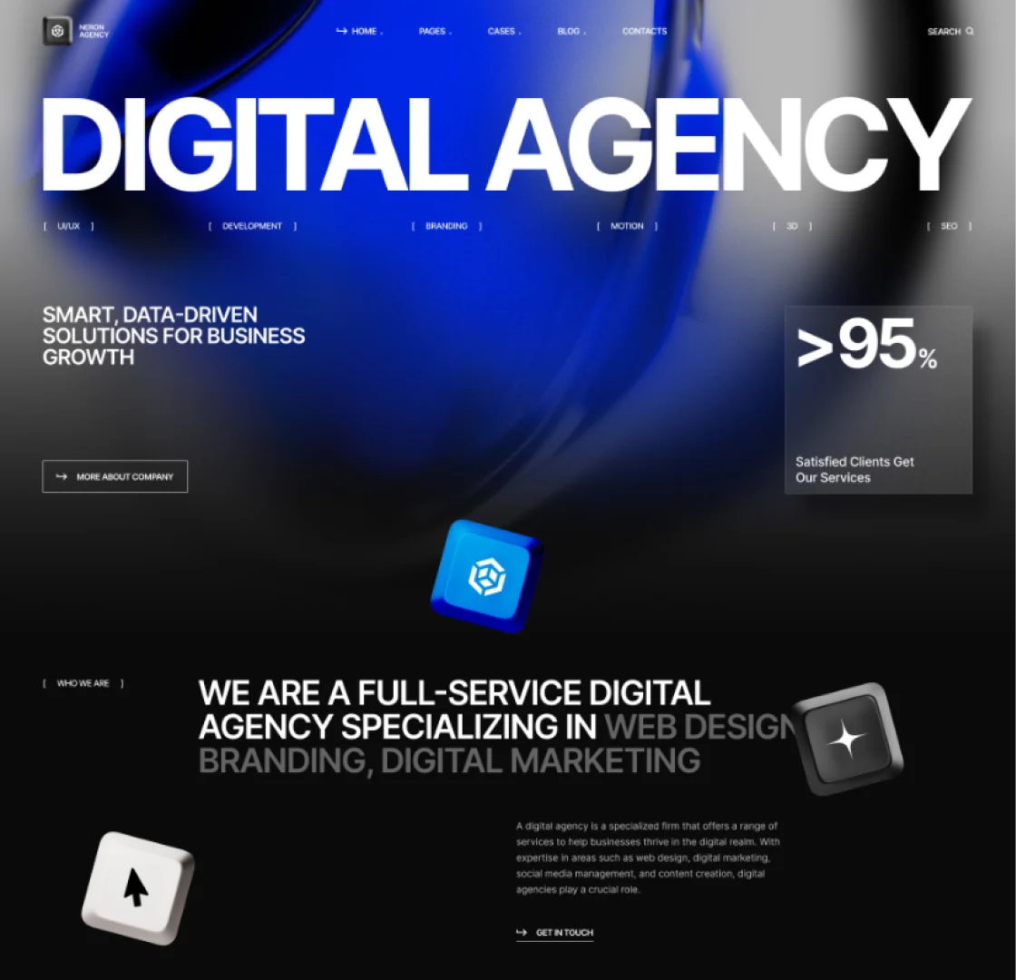
In today’s digital landscape, it’s not enough to simply have a website — it needs to be mobile-ready. With over 60% of web traffic now coming from mobile devices, users expect websites to load fast, look great, and function smoothly on smartphones and tablets. Yet, many businesses still treat mobile optimization as an afterthought. Since 2019, Google uses mobile-first indexing. That means Google predominantly uses the mobile version of your site for ranking and indexing — not the desktop version.

Consumers are constantly on the go, and they want instant access to information. Whether they’re searching for a product, reading reviews, or contacting your business, first impressions now happen on mobile.

Conversions Depend on Mobile Performance

Since 2019, Google uses mobile-first indexing. That means Google predominantly uses the mobile version of your site for ranking and indexing — not the desktop version. So if your mobile site isn’t up to par, you’re not just affecting user experience — you’re hurting your SEO too.
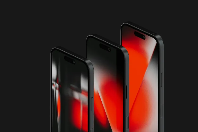
How to Know If Your Site Is Mobile-Ready

Here’s a checklist to help evaluate your current website:

  • Responsive Design. Does your layout automatically adjust to different screen sizes?
  • Fast Load Time. Does your site load in under 3 seconds on mobile?
  • Clear Navigation. Are menus and buttons easy to use with fingers (not just a mouse)?
  • Readable Text. Is the font size large enough without zooming?

Final Thoughts

A mobile-ready website is no longer optional — it’s a core requirement for doing business online. Whether you’re generating leads, selling products, or simply providing information, your mobile experience can make or break user trust. If your site isn’t mobile-friendly, you’re likely leaving money on the table.

Not sure where to start? Our team can help audit, redesign, or rebuild your website to be fully optimized for mobile — fast, accessible, and built for resultsrr

Read More
bl2
Technology
October 21, 2025by nextwinindia

Design Trends to Watch

In today’s digital landscape, it’s not enough to simply have a website — it needs to be mobile-ready. With over 60% of web traffic now coming from mobile devices, users expect websites to load fast, look great, and function smoothly on smartphones and tablets. Yet, many businesses still treat mobile optimization as an afterthought. Since 2019, Google uses mobile-first indexing. That means Google predominantly uses the mobile version of your site for ranking and indexing — not the desktop version.

Consumers are constantly on the go, and they want instant access to information. Whether they’re searching for a product, reading reviews, or contacting your business, first impressions now happen on mobile.

Conversions Depend on Mobile Performance

Since 2019, Google uses mobile-first indexing. That means Google predominantly uses the mobile version of your site for ranking and indexing — not the desktop version. So if your mobile site isn’t up to par, you’re not just affecting user experience — you’re hurting your SEO too.

How to Know If Your Site Is Mobile-Ready

Here’s a checklist to help evaluate your current website:

  • Responsive Design. Does your layout automatically adjust to different screen sizes?
  • Fast Load Time. Does your site load in under 3 seconds on mobile?
  • Clear Navigation. Are menus and buttons easy to use with fingers (not just a mouse)?
  • Readable Text. Is the font size large enough without zooming?

Final Thoughts

A mobile-ready website is no longer optional — it’s a core requirement for doing business online. Whether you’re generating leads, selling products, or simply providing information, your mobile experience can make or break user trust. If your site isn’t mobile-friendly, you’re likely leaving money on the table.

Not sure where to start? Our team can help audit, redesign, or rebuild your website to be fully optimized for mobile — fast, accessible, and built for resultsrr

Read More
bl3
Technology
October 21, 2025by nextwinindia

How to Build a Strong UX

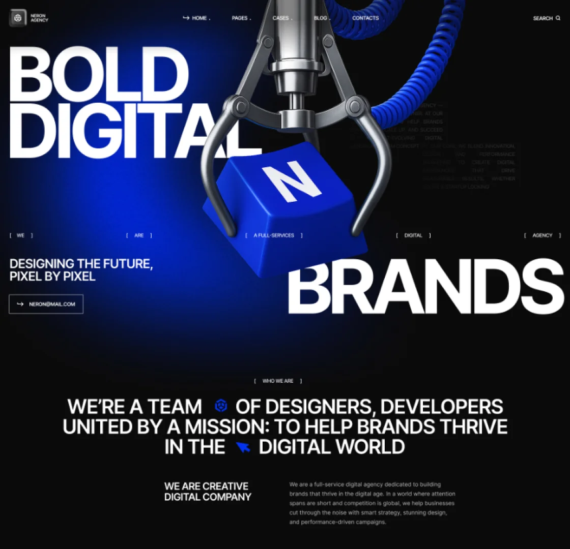
In today’s digital landscape, it’s not enough to simply have a website — it needs to be mobile-ready. With over 60% of web traffic now coming from mobile devices, users expect websites to load fast, look great, and function smoothly on smartphones and tablets. Yet, many businesses still treat mobile optimization as an afterthought. Since 2019, Google uses mobile-first indexing. That means Google predominantly uses the mobile version of your site for ranking and indexing — not the desktop version.

Consumers are constantly on the go, and they want instant access to information. Whether they’re searching for a product, reading reviews, or contacting your business, first impressions now happen on mobile.

Conversions Depend on Mobile Performance

Since 2019, Google uses mobile-first indexing. That means Google predominantly uses the mobile version of your site for ranking and indexing — not the desktop version. So if your mobile site isn’t up to par, you’re not just affecting user experience — you’re hurting your SEO too.

How to Know If Your Site Is Mobile-Ready

Here’s a checklist to help evaluate your current website:

  • Responsive Design. Does your layout automatically adjust to different screen sizes?
  • Fast Load Time. Does your site load in under 3 seconds on mobile?
  • Clear Navigation. Are menus and buttons easy to use with fingers (not just a mouse)?
  • Readable Text. Is the font size large enough without zooming?

Final Thoughts

A mobile-ready website is no longer optional — it’s a core requirement for doing business online. Whether you’re generating leads, selling products, or simply providing information, your mobile experience can make or break user trust. If your site isn’t mobile-friendly, you’re likely leaving money on the table.

Not sure where to start? Our team can help audit, redesign, or rebuild your website to be fully optimized for mobile — fast, accessible, and built for resultsrr
Read More
bl4
Design
October 21, 2025by nextwinindia

The Power of Microcopy

In today’s digital landscape, it’s not enough to simply have a website — it needs to be mobile-ready. With over 60% of web traffic now coming from mobile devices, users expect websites to load fast, look great, and function smoothly on smartphones and tablets. Yet, many businesses still treat mobile optimization as an afterthought. Since 2019, Google uses mobile-first indexing. That means Google predominantly uses the mobile version of your site for ranking and indexing — not the desktop version.

Consumers are constantly on the go, and they want instant access to information. Whether they’re searching for a product, reading reviews, or contacting your business, first impressions now happen on mobile.

Conversions Depend on Mobile Performance

Since 2019, Google uses mobile-first indexing. That means Google predominantly uses the mobile version of your site for ranking and indexing — not the desktop version. So if your mobile site isn’t up to par, you’re not just affecting user experience — you’re hurting your SEO too.

How to Know If Your Site Is Mobile-Ready

Here’s a checklist to help evaluate your current website:

  • Responsive Design. Does your layout automatically adjust to different screen sizes?
  • Fast Load Time. Does your site load in under 3 seconds on mobile?
  • Clear Navigation. Are menus and buttons easy to use with fingers (not just a mouse)?
  • Readable Text. Is the font size large enough without zooming?

Final Thoughts

A mobile-ready website is no longer optional — it’s a core requirement for doing business online. Whether you’re generating leads, selling products, or simply providing information, your mobile experience can make or break user trust. If your site isn’t mobile-friendly, you’re likely leaving money on the table.

Not sure where to start? Our team can help audit, redesign, or rebuild your website to be fully optimized for mobile — fast, accessible, and built for resultsrr

Read More
bl5
Technology
October 21, 2025by nextwinindia

Email Marketing Isn’t Dead

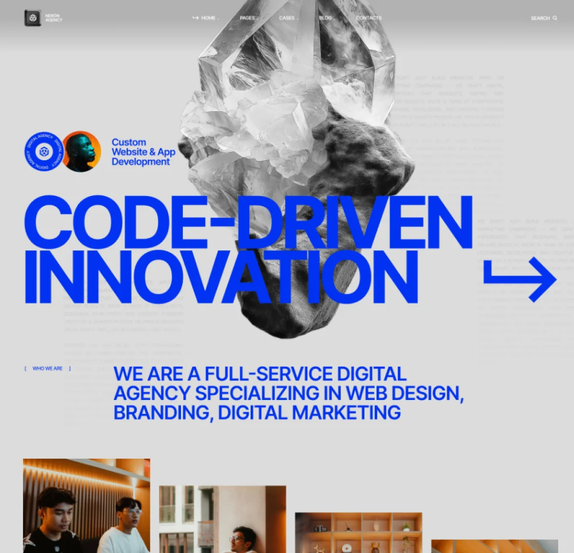
In today’s digital landscape, it’s not enough to simply have a website — it needs to be mobile-ready. With over 60% of web traffic now coming from mobile devices, users expect websites to load fast, look great, and function smoothly on smartphones and tablets. Yet, many businesses still treat mobile optimization as an afterthought. Since 2019, Google uses mobile-first indexing. That means Google predominantly uses the mobile version of your site for ranking and indexing — not the desktop version.

Consumers are constantly on the go, and they want instant access to information. Whether they’re searching for a product, reading reviews, or contacting your business, first impressions now happen on mobile.

Conversions Depend on Mobile Performance

Since 2019, Google uses mobile-first indexing. That means Google predominantly uses the mobile version of your site for ranking and indexing — not the desktop version. So if your mobile site isn’t up to par, you’re not just affecting user experience — you’re hurting your SEO too.

How to Know If Your Site Is Mobile-Ready

Here’s a checklist to help evaluate your current website:

  • Responsive Design. Does your layout automatically adjust to different screen sizes?
  • Fast Load Time. Does your site load in under 3 seconds on mobile?
  • Clear Navigation. Are menus and buttons easy to use with fingers (not just a mouse)?
  • Readable Text. Is the font size large enough without zooming?

Final Thoughts

A mobile-ready website is no longer optional — it’s a core requirement for doing business online. Whether you’re generating leads, selling products, or simply providing information, your mobile experience can make or break user trust. If your site isn’t mobile-friendly, you’re likely leaving money on the table.

Not sure where to start? Our team can help audit, redesign, or rebuild your website to be fully optimized for mobile — fast, accessible, and built for resultsrr
Read More
bl6
Branding
October 21, 2025by nextwinindia

Aesthetics in Web Design

In today’s digital landscape, it’s not enough to simply have a website — it needs to be mobile-ready. With over 60% of web traffic now coming from mobile devices, users expect websites to load fast, look great, and function smoothly on smartphones and tablets. Yet, many businesses still treat mobile optimization as an afterthought. Since 2019, Google uses mobile-first indexing. That means Google predominantly uses the mobile version of your site for ranking and indexing — not the desktop version.

Consumers are constantly on the go, and they want instant access to information. Whether they’re searching for a product, reading reviews, or contacting your business, first impressions now happen on mobile.

Conversions Depend on Mobile Performance

Since 2019, Google uses mobile-first indexing. That means Google predominantly uses the mobile version of your site for ranking and indexing — not the desktop version. So if your mobile site isn’t up to par, you’re not just affecting user experience — you’re hurting your SEO too.

How to Know If Your Site Is Mobile-Ready

Here’s a checklist to help evaluate your current website:

  • Responsive Design. Does your layout automatically adjust to different screen sizes?
  • Fast Load Time. Does your site load in under 3 seconds on mobile?
  • Clear Navigation. Are menus and buttons easy to use with fingers (not just a mouse)?
  • Readable Text. Is the font size large enough without zooming?

Final Thoughts

A mobile-ready website is no longer optional — it’s a core requirement for doing business online. Whether you’re generating leads, selling products, or simply providing information, your mobile experience can make or break user trust. If your site isn’t mobile-friendly, you’re likely leaving money on the table.

Not sure where to start? Our team can help audit, redesign, or rebuild your website to be fully optimized for mobile — fast, accessible, and built for resultsrr

Read More
bl7
Digital
October 21, 2025by nextwinindia

What Makes Great Content?

In today’s digital landscape, it’s not enough to simply have a website — it needs to be mobile-ready. With over 60% of web traffic now coming from mobile devices, users expect websites to load fast, look great, and function smoothly on smartphones and tablets. Yet, many businesses still treat mobile optimization as an afterthought. Since 2019, Google uses mobile-first indexing. That means Google predominantly uses the mobile version of your site for ranking and indexing — not the desktop version.

Consumers are constantly on the go, and they want instant access to information. Whether they’re searching for a product, reading reviews, or contacting your business, first impressions now happen on mobile.

Conversions Depend on Mobile Performance

Since 2019, Google uses mobile-first indexing. That means Google predominantly uses the mobile version of your site for ranking and indexing — not the desktop version. So if your mobile site isn’t up to par, you’re not just affecting user experience — you’re hurting your SEO too.

How to Know If Your Site Is Mobile-Ready

Here’s a checklist to help evaluate your current website:

  • Responsive Design. Does your layout automatically adjust to different screen sizes?
  • Fast Load Time. Does your site load in under 3 seconds on mobile?
  • Clear Navigation. Are menus and buttons easy to use with fingers (not just a mouse)?
  • Readable Text. Is the font size large enough without zooming?

Final Thoughts

A mobile-ready website is no longer optional — it’s a core requirement for doing business online. Whether you’re generating leads, selling products, or simply providing information, your mobile experience can make or break user trust. If your site isn’t mobile-friendly, you’re likely leaving money on the table.

Not sure where to start? Our team can help audit, redesign, or rebuild your website to be fully optimized for mobile — fast, accessible, and built for resultsrr

Read More
bl8
Design
October 21, 2025by nextwinindia

Is Your Website Mobile-Ready?

In today’s digital landscape, it’s not enough to simply have a website — it needs to be mobile-ready. With over 60% of web traffic now coming from mobile devices, users expect websites to load fast, look great, and function smoothly on smartphones and tablets. Yet, many businesses still treat mobile optimization as an afterthought. Since 2019, Google uses mobile-first indexing. That means Google predominantly uses the mobile version of your site for ranking and indexing — not the desktop version.

Consumers are constantly on the go, and they want instant access to information. Whether they’re searching for a product, reading reviews, or contacting your business, first impressions now happen on mobile.

Conversions Depend on Mobile Performance

Since 2019, Google uses mobile-first indexing. That means Google predominantly uses the mobile version of your site for ranking and indexing — not the desktop version. So if your mobile site isn’t up to par, you’re not just affecting user experience — you’re hurting your SEO too.

How to Know If Your Site Is Mobile-Ready

Here’s a checklist to help evaluate your current website:

  • Responsive Design. Does your layout automatically adjust to different screen sizes?
  • Fast Load Time. Does your site load in under 3 seconds on mobile?
  • Clear Navigation. Are menus and buttons easy to use with fingers (not just a mouse)?
  • Readable Text. Is the font size large enough without zooming?

Final Thoughts

A mobile-ready website is no longer optional — it’s a core requirement for doing business online. Whether you’re generating leads, selling products, or simply providing information, your mobile experience can make or break user trust. If your site isn’t mobile-friendly, you’re likely leaving money on the table.

Not sure where to start? Our team can help audit, redesign, or rebuild your website to be fully optimized for mobile — fast, accessible, and built for resultsrr

Read More
bl9
Branding
October 21, 2025by nextwinindia

Building Trust Through Design

In today’s digital landscape, it’s not enough to simply have a website — it needs to be mobile-ready. With over 60% of web traffic now coming from mobile devices, users expect websites to load fast, look great, and function smoothly on smartphones and tablets. Yet, many businesses still treat mobile optimization as an afterthought. Since 2019, Google uses mobile-first indexing. That means Google predominantly uses the mobile version of your site for ranking and indexing — not the desktop version.

Consumers are constantly on the go, and they want instant access to information. Whether they’re searching for a product, reading reviews, or contacting your business, first impressions now happen on mobile.

Conversions Depend on Mobile Performance

Since 2019, Google uses mobile-first indexing. That means Google predominantly uses the mobile version of your site for ranking and indexing — not the desktop version. So if your mobile site isn’t up to par, you’re not just affecting user experience — you’re hurting your SEO too.

How to Know If Your Site Is Mobile-Ready

Here’s a checklist to help evaluate your current website:

  • Responsive Design. Does your layout automatically adjust to different screen sizes?
  • Fast Load Time. Does your site load in under 3 seconds on mobile?
  • Clear Navigation. Are menus and buttons easy to use with fingers (not just a mouse)?
  • Readable Text. Is the font size large enough without zooming?

Final Thoughts

A mobile-ready website is no longer optional — it’s a core requirement for doing business online. Whether you’re generating leads, selling products, or simply providing information, your mobile experience can make or break user trust. If your site isn’t mobile-friendly, you’re likely leaving money on the table.

Not sure where to start? Our team can help audit, redesign, or rebuild your website to be fully optimized for mobile — fast, accessible, and built for resultsrr

Read More
bl10
Technology
October 21, 2025by nextwinindia

Your First 5 Seconds Online

In today’s digital landscape, it’s not enough to simply have a website — it needs to be mobile-ready. With over 60% of web traffic now coming from mobile devices, users expect websites to load fast, look great, and function smoothly on smartphones and tablets. Yet, many businesses still treat mobile optimization as an afterthought. Since 2019, Google uses mobile-first indexing. That means Google predominantly uses the mobile version of your site for ranking and indexing — not the desktop version.

Consumers are constantly on the go, and they want instant access to information. Whether they’re searching for a product, reading reviews, or contacting your business, first impressions now happen on mobile.

Conversions Depend on Mobile Performance

Since 2019, Google uses mobile-first indexing. That means Google predominantly uses the mobile version of your site for ranking and indexing — not the desktop version. So if your mobile site isn’t up to par, you’re not just affecting user experience — you’re hurting your SEO too.

How to Know If Your Site Is Mobile-Ready

Here’s a checklist to help evaluate your current website:

  • Responsive Design. Does your layout automatically adjust to different screen sizes?
  • Fast Load Time. Does your site load in under 3 seconds on mobile?
  • Clear Navigation. Are menus and buttons easy to use with fingers (not just a mouse)?
  • Readable Text. Is the font size large enough without zooming?

Final Thoughts

A mobile-ready website is no longer optional — it’s a core requirement for doing business online. Whether you’re generating leads, selling products, or simply providing information, your mobile experience can make or break user trust. If your site isn’t mobile-friendly, you’re likely leaving money on the table.

Not sure where to start? Our team can help audit, redesign, or rebuild your website to be fully optimized for mobile — fast, accessible, and built for resultsrr

Read More
  • 1
  • 2

©2025-neron-

©2025-neron-©2025-neron-©2025-neron-©2025-neron-©2025-neron-

address:   27 Division St, NY 10002 USA

mail:        neron@mail.com

phone:        +1 800 123 65 77

X-twitterFacebookInstagramLinkedin-in

[Copyright © 2025. neron by WGL]

[cookies policy]

[Privacy policy]

[Terms & Conditions]

Website security powered by MilesWeb